How to Write a "How it Works" Module For a Landing Page
May 15, 2019
You see them everywhere these days, subtle variations on the same pattern:
Three icons. Three value propositions.
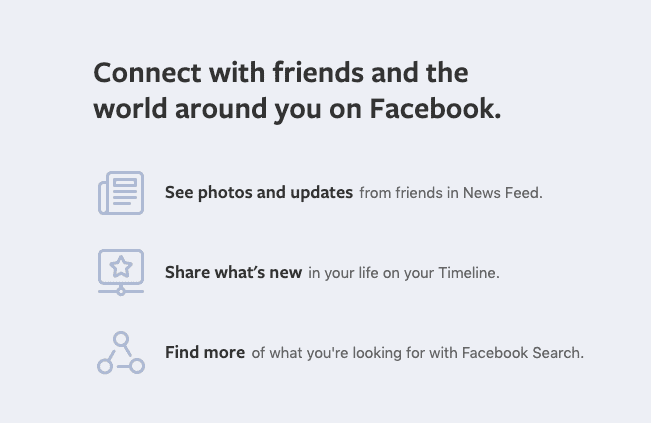
Facebook’s homepage “how it works” three-up is vertically stacked, “feature-focused” and you’ve probably never seen it. Facebook’s homepage is like Bigfoot—rarely seen, but definitely real.
Sometimes there’s a headline. Sometimes there’s three sub-headlines. Sometimes (but not always) there’s a button that takes you to another page.
Sometimes they’re vertically stacked on top of one another, sometimes they run horizontally across the screen.
Some designers and writers call these designs “three-ups”, others call them the HIW (or “How it works”) modules. Whatever you want to call them, they’re a necessary pattern to have if you want to sell something on the Internet.
Some people (like me) might even call them a cliche’. And some people (me again) are not wrong. These things are so ubiquitous now that they absolutely, unequivocally are a cliche’.
But that doesn’t mean you should not keep this design pattern in your arsenal as a UX writer.
Why?
Three reasons:
- it makes it easy to get a lot of info into a single screen
- it looks good on pretty much any device
- it satisfies a deeper human desire to process information in groups of three†
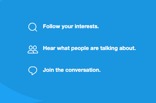
In their homepage 3-up copy, Twitter (wisely) left out the part where they foment hatred and help demagogues win elections.
This phenomenon of human psychology is called the rule of three, and it’s pretty much copywriting witchcraft. Most effective “how it works” (or ‘HIW’) patterns make use of this rule, and for good reason; it works.
The HIW is so effective because it uses the basic elements of good storytelling (beginning, middle and end) and leaves the user satisfied, informed and ready to take action—provided they’re well-written. Which is easy to do if you follow this simple three-step process.
Step 1. List out things that make your product rad
Sit down at a desk with a stack of post-it notes, a sharpie marker and at least 30 minutes to kill. Then starts scribbling every feature, value proposition or experiential component of this product that makes it unique.
At a minimum, try and come up with 10 things. If you’ve got 20, that’s great but you probably don’t need that many.

This is not a card sort, it’s a really disorganized Kanban board that I used to keep myself on track while building the Daily UX Writing Challenge. But it looks cool. So, there’s that.
Once you’ve got a whole messy stack of post-its, do a quick card sort and organize what you’ve written into affinity groups. Your results may vary, but usually each post-it will fall into one of a few categories: feature-focused (“listen to music everywhere” or “free shipping”) or process-oriented (“sign up with Facebook”, “connect to your Nest thermostat”) or a special kind of ‘hybrid’ (“download the Chrome extension and start savings”).
Now, throw out the dumb ones. You’ll have them, and they’ll be obvious.
If your product actually has 20 features that make it ‘mind-bendingly’ cool, that’s great. Congratulations on being better than Google and Apple combined.
Step 2. Choose three of them
Once you have your sorted features (and provided you have the resources) you should get some customer feedback on how the things you’ve written “rank” in terms of perceived customer value.
A good (and relatively cheap) way to do this is ask random users to rank them using a turnkey usability testing solution like Usability Hub or Survey Monkey.
Make this as straightforward as possible: present the users with 7 of the product features and ask them to rank them from “worst” (1) to “best” (7). Your basic “Likert” scale.††
After about 20 of survey responses you’ll start to notice that some patterns will emerge. Pay attention to what the users are saying too, they may give you some insight into what the copy should say once it’s time to actually start “writing”.
3. Start writing
A good HIW can be feature-focused or procedure-focused.††† Take the combined results of the user tests and the need of the product at that particular moment—and that’s what type of module you’ll want to write.
If you plan on writing a feature-focused three-up, start with the primary value proposition of your product (the one that the users consistently ranked the “highest”) and then work your way down.
How to order them
Conventional psychology tells us that most people either read from the side of the screen from left to right) the classic “Magic F” pattern) or they scan from the top left to the top right and then back to the lowest left corner and then back to the bottom right; the aptly named Z-Pattern.
In other words: people are all over the place when reading on the web. Design your “three-up” in a way that will get the user’s attention regardless of which behavior they’re exhibiting. The easiest way to do this is to make each one of the three sections compelling independent of one another.
There’s an added benefit to this approach: if you can mix and match the items irrespective of order then you’ll have another fun thing to “test” if your product optimization team is having a light week.
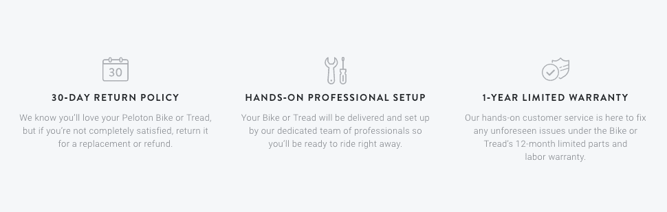
Peleton focuses on the virtues of their buying and customer experience. They have to. They need to distract you from the fact that you just dropped enough cash to cover three months of daycare in America on a stationary bike. Which is sad for so many reasons.

Inspire uses a procedural approach in this three-up. I used to work there but I didn’t write this. That’s probably why it’s good.
“Procedural HIWs” are a walk in the park. Just jot down the first step a user must take in order to engage with your invention. Make it sound like it’s the easiest and most intuitive thing in the world and if they don’t do it, then there is no possible way they can take advantage of the full breadth of the product.
Think of them as a method of creating a sexy and concise instruction manual.
And there you have it, the basics of how to write a “how it works” component.
As always, if you have any suggestions for how we may improve this article or if you just want to talk shop, send us an email: contact@dailyuxwriting.com
† “The Rule of Three” principle extends to a lot more than just writing. In a nutshell it’s the idea that people are better able to remember three things in a sequence than they are at remembering two or five. More on that in a later post. Or, just read Brian Clark’s take.
†† The Likert scale is a blunt but useful polling format when you want to gauge sentiment or importance on a linear scale. More on that in a later post. Or, click this link.
††† It’s never wise to mix mediums here, so if you want to emphasize features (free shipping, free returns etc.) don’t try and cram a “process” bullet in there—you’re trying to tell two different stories, and the plots probably aren’t going to merge.

TL;DR is a blog about how to write short, effective copy for user interfaces and digital products. Brought to you by Ryan Farrell, maker of Daily UX Writing. Follow on Twitter.