How to Use Comedy in UX Writing (Decision Tree)
July 18, 2019
As anyone who subscribes to the Daily UX Writing Challenge will tell you, I’m f*cking hilarious.
Wait, don’t leave!
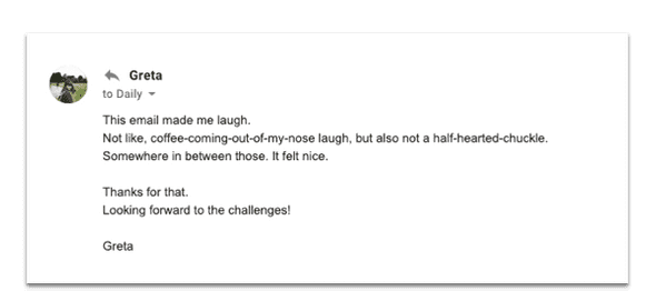
Ok I’ll admit that I’m no Mel Brooks. But seriously, check this out, this is feedback from a user in response to the DUXW welcome email that I send to new subscribers:
God bless you, Greta. You have no idea how much I need(ed) your kind words.
Now, I’m not telling you this to brag about how funny I am.†
I’m telling you this because I’m a strong believer in the idea that if someone makes a “thing” and puts it on the Internet, then that person should at least have a basic understanding of what the “thing” they made is all about.
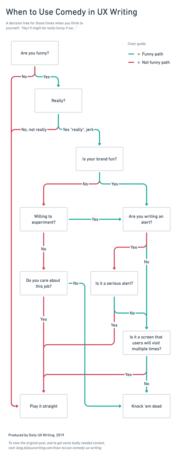
I myself built a “thing” which you can view below. It’s a “decision tree” diagram that a person can use as a quick reference tool to help decide when, and more importantly, when not to use comedy and humor when crafting UX copy.
But, who the hell am I, right?
Accordingly, I have shared the complimentary email so that you, dear reader, can view the below diagram knowing that someone on earth once thought that something I wrote was funny enough to make them, in their own words…
“not like, coffee-coming-out-of-my-nose laugh, but also not a half-hearted-chuckle.”
We good? Cool.
When it comes to comedy writing there’s a few golden rules to remember:
- Know the basic structure of what makes something funny. It helps to do the reading. Tracey Playle’s “You’re having a laugh: Engaging through giggles and guffaws” is required viewing if you want to throw jokes around inside the product. Likewise this post: “Humor in microcopy: 7 guidelines to do it right”, by Kinneret Yifrath is required reading.††
- Use comedy strictly in moderation. If you think you may have too many jokes in an experience, you’re right.
- Use Comedy ONLY when appropriate. Nothing is worse than trying to get a laugh out of someone when you’re telling them their flight has been cancelled, their file has been erased or a fire has broken out near their home.†††
Armed with these three tenets, you can now safely use the below paradigm for any instance where you might be considering writing a joke within a digital experience.
Also (affiliate link alert!) “Comedy Writing Secrets” by Mel Helitzer is a fantastic, though sometimes “dry” (ironic, no?) book about comedic structure and writing methods. Pick up a copy if you wanna dig into the topic of comedic structure a bit more. ††††
If you think I missed a step or that there’s more to add to this tree, send me an email! ryan@dailyuxwriting.com Seriously. I am far from infallible. Call me out, we’ll probably become friends.
I included a small blurb about Comedy in UX Writing in my UX Writing Basics guide, but I got a lot of follow-up questions about it, and figured it was important enough that creating a quick diagram in Whimsical would not be a total waste of time.
Go get ‘em!
† I’m only KIND OF telling you this in order to brag about how funny I am. Huge difference.
†† A great deal of the content in both that article and talk informed my diagram. You might even say it is just a visual representation of the words that these two women spoke and wrote, respectively—which would be a cool compliment, but wasn’t by design. They are both way smarter than I am. I encourage you to follow Kinneret on Medium and Tracy on Twitter.
††† Those of you who have taken the Daily UX Writing Challenge know exactly what I’m talking about.
†††† If you do buy a copy at the aforementioned link (here it is again), you’ll also be helping to fund this blog! So it’s a win/win in my humble opinion. Good job, you.
TL;DR is a blog about how to write short, effective copy for user interfaces and digital products. Brought to you by Ryan Farrell, maker of Daily UX Writing. Follow on Twitter.

